ShopDreamUp AI ArtDreamUp

Deviation Actions


Suggested Deviants


Suggested Collections


You Might Like…


Featured in Groups


Comments9
Join the community to add your comment. Already a deviant? Log In
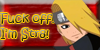
Ah, you've got a really good basic foundation here! You chose a simple background and shadow, which isn't anything unique or eye popping, but it's tried and true so your character's not just floating. You pulled it off well here.
Your linework is smooth, however it's a little stiff. You seem to use a lot of mostly straight lines. You used curved lines for his Akatsuki uniform design, but the rest are very angular.
His facial features are pretty spot on, though his jawline goes back too far. The eyes, nose, and mouth are generally in their proper places. Speaking of the eye, the angular look works here a little better, especially considering male anime eyes tend to be that way just generally.
Your shading isn't bad, but could use improvement. You don't use enough of it, it seems, and it's very subtle to see. Especially on the skin, shadows tend to be pretty dark. The way it's shaded here makes Deidara seem covered in flat colors. Not bad, but you've got more talent than that.
I'd start practicing with highlights at this point as well. As I said, his colors are rather flat, and that's particularly noticeable in his hair. It doesn't have much life to it. His shoulders could be widened a bit as well; he has very feminine shoulders here.
Overall, I'd say that while your art (and literally everyone else's) can be improved a great deal, it doesn't look bad by any stretch of the means! You use smooth lines, pleasant colors, this was a very nice, aloof pose, and your anatomy isn't bad. You show a lot of promise as an artist and I can only hope that what I've said here helps! Even if it's just a little. =3 Keep it up! I'm curious to see your progress as an artist, so you've earned yourself a new watcher. Keep getting better. ^^